
 By admin
How to Improve Website Usability: A Complete Guide to Enhancing User Experience and Engagement
Introduction
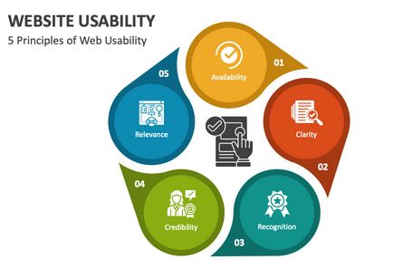
In the digital age, your website is your most powerful tool for connecting with users, building credibility, and driving conversions. But no matter how visually stunning your web design is, if users struggle to navigate, read, or interact with your content, your site becomes little more than a digital brochure—pretty, but ineffective.
Website usability refers to how easily visitors can use and interact with your website. It influences user satisfaction, bounce rate, search engine rankings, and ultimately, your bottom line. This guide explores the latest and most effective strategies to improve your website’s usability and create a smooth, intuitive experience that keeps users engaged.
Whether you’re running an e-commerce store, a blog, or a corporate website, enhancing usability is a must for online success. In this article, we’ll walk through key aspects of web usability—from typography and navigation to load speed and technical performance.
1. Optimize Your Website Typography for Readability
1.1. Use Readable Fonts and Sizes
Typography plays a crucial role in how users consume your content. If your text is too small, too cramped, or overly stylized, visitors may leave out of frustration. Here are key best practices:
-
Use Legible Fonts: Stick with web-safe, clean fonts like Arial, Roboto, Helvetica, or Georgia.
-
Set Proper Font Sizes: A minimum of 16px is recommended for body text, with headings larger and clearly distinguishable.
-
Limit Font Families: Using 2–3 font families helps maintain visual consistency without overwhelming users.
1.2. Line Spacing and Line Length
Proper line spacing improves scannability and reduces eye fatigue:
-
Line Height (Leading): Use CSS to apply a line-height of 1.5 to 1.8 for body text.
-
Line Length: Aim for 50–75 characters per line to keep content digestible.
These small adjustments can make a huge difference in how users interact with your content, especially on long pages and blog posts.
2. Improve Navigation and Content Discovery
2.1. Implement a Clear Navigation Structure
Users should be able to find what they’re looking for without thinking too hard. Keep navigation intuitive and predictable:
-
Top Navigation Bar: Keep it visible and consistent across all pages.
-
Breadcrumbs: Help users trace their path and return to previous categories or pages.
-
Sticky Menus: For content-rich sites, sticky headers with navigation elements keep key links always accessible.
2.2. Add a Powerful Search Feature
If your site hosts a large amount of content—such as blog posts, product listings, or documentation—search functionality is non-negotiable. Consider the following:
-
Built-in Search Bar: Place it at the top of your pages for easy access.
-
Filter and Sort Options: Especially useful for e-commerce or content-heavy platforms.
-
Autocomplete and Suggestions: Improve user experience by offering relevant suggestions as users type.
2.3. Use Indexes, Tags, and Categories
Help users browse by organizing your content with:
-
Tags and Categories: Offer a logical breakdown of topics or product types.
-
Article Indexes or Glossaries: For resource libraries or educational sites, an alphabetical index can guide users efficiently.
3. Enhance Website Loading Speed
3.1. Why Speed Matters
Website speed isn’t just about convenience—it’s about retention and SEO. According to Google, a one-second delay in page load can result in a 7% reduction in conversions.
3.2. How to Improve Load Times
Here are effective ways to enhance site speed:
-
Compress Images: Use tools like TinyPNG or WebP format to reduce image sizes without sacrificing quality.
-
Enable Caching: Browser caching helps returning visitors load your site faster.
-
Minify CSS, JavaScript, and HTML: Remove unnecessary spaces and characters in your code for leaner files.
-
Use a Content Delivery Network (CDN): Distribute content globally to ensure faster access from various locations.
3.3. Test and Monitor Regularly
Use tools like:
-
Google PageSpeed Insights
-
GTmetrix
-
Pingdom
These can help you identify bottlenecks and monitor real-world performance across different devices and regions.
4. Ensure Mobile Usability
4.1. Adopt a Mobile-First Design Approach
Over 60% of global website traffic now comes from mobile devices. If your site isn’t mobile-friendly, you’re losing a massive audience.
Key mobile usability practices:
-
Responsive Design: Ensure your site adapts seamlessly to various screen sizes.
-
Touch-Friendly Buttons: Make sure buttons and links are easily clickable without zooming.
-
Avoid Pop-Ups: Especially on mobile, pop-ups can ruin the user experience and increase bounce rate.
4.2. Test Across Devices
Use emulators and real-device testing to see how your site performs on:
-
iPhones and Android devices
-
Tablets
-
Various screen resolutions
Google’s Mobile-Friendly Test tool is a good starting point.
5. Regularly Test and Fix Broken Links
5.1. Why Broken Links Are Harmful
Broken links frustrate users, damage your site’s credibility, and hurt your SEO performance. If a visitor lands on a dead-end page, they’re likely to leave and not return.
5.2. How to Identify and Repair Broken Links
-
Automated Tools: Use platforms like Screaming Frog, Ahrefs, or Broken Link Checker.
-
Google Search Console: Regularly review your site’s crawl errors and fix any 404 issues.
-
Manual Testing: Especially before launching or updating your site, click through links to ensure functionality.
6. Maintain Consistency Across All Pages
6.1. Visual Consistency
-
Use a Design System: Define standard colors, fonts, button styles, and iconography.
-
Consistent Layouts: Keep headers, footers, and sidebars uniform to reduce user disorientation.
6.2. Functional Consistency
-
Repetitive Elements: Navigation menus, call-to-action buttons, and forms should work similarly across all pages.
-
Feedback Messages: Use the same design and placement for success or error messages.
Consistency builds trust and allows users to learn your site’s structure quickly, improving engagement.
7. Improve Accessibility for All Users
7.1. Implement Accessibility Best Practices
Accessible design ensures that users with disabilities can navigate and interact with your content:
-
Alt Text for Images: Describe images clearly for screen readers.
-
Keyboard Navigation: Allow site navigation without a mouse.
-
Contrast and Color Choices: Use color combinations that are easy to read, even for those with visual impairments.
7.2. Follow WCAG Guidelines
Refer to the Web Content Accessibility Guidelines (WCAG) to ensure your site meets modern accessibility standards.
Conclusion
Improving your website’s usability isn’t a one-time task—it’s an ongoing commitment to providing value, clarity, and accessibility to your users. From optimizing typography and navigation to ensuring speed and mobile responsiveness, every change you make contributes to a more engaging and successful online presence.
By focusing on user-centric design and regularly testing your site’s performance, you not only enhance user satisfaction but also improve your SEO rankings, reduce bounce rates, and increase conversions. In today’s competitive digital landscape, usability isn’t just a luxury—it’s a necessity.
Start implementing these tips today, and turn your website from a pretty shell into a powerful, results-driven platform.